
Line Graph: Definition, Types, Parts, Uses, and Examples
A line graph is a type of chart used to represent data over time. It consists of a series of data points connected by straight lines, which allows for the visualization of trends and patterns. Line graphs are commonly used in various fields, including economics, finance, science, and social sciences.
There are several types of line graphs, each serving a specific purpose:
- Time Series Line Graph: This type of line graph displays data points in chronological order, allowing for the analysis of trends and changes over time. It is often used to track stock prices, weather patterns, population growth, and other time-dependent variables.
- Comparison Line Graph: This type of line graph is used to compare multiple sets of data over time. It is commonly used to analyze market trends, sales performance, and survey results.
- Distribution Line Graph: This type of line graph represents the distribution of a variable over time. It is often used in statistical analysis to visualize the spread and variability of data.
A line graph consists of several parts:
- X-Axis: The horizontal axis represents the independent variable, usually time, and is divided into equal intervals. It provides a reference for the data points along the graph.
- Y-Axis: The vertical axis represents the dependent variable and is also divided into equal intervals. It shows the values corresponding to each data point.
- Data Points: These are the individual values plotted on the graph. They are connected by straight lines to show the overall trend.
- Title: The title of the line graph provides a brief description of the data being represented.
- Legend: The legend explains the meaning of different colors or symbols used in the graph to represent different variables or data sets.
Line graphs have various uses in different fields:
- In economics and finance, line graphs are used to analyze stock market trends, track economic indicators, and forecast future performance.
- In science, line graphs are used to represent experimental data, track changes in variables over time, and analyze scientific phenomena.
- In social sciences, line graphs are used to visualize survey results, track social trends, and analyze demographic data.
Here are some examples of line graphs:
- A line graph showing the temperature changes throughout the year in different cities.
- A line graph representing the sales performance of a product over a period of time.
- A line graph illustrating the population growth of a country over several decades.
Definition of Line Graph
A line graph is a type of chart that displays data points connected by straight lines. It is commonly used to show how data changes over time or to compare multiple sets of data. The x-axis represents the independent variable, such as time, while the y-axis represents the dependent variable, such as quantity or value.
Line graphs are particularly useful for visualizing trends and patterns in data. They allow viewers to easily see the relationship between variables and identify any changes or fluctuations over time. The lines in a line graph can be solid or dashed, depending on the preference of the presenter or the purpose of the graph.
Line graphs are commonly used in various fields, including finance, economics, science, and social sciences. They can be used to analyze stock market trends, track population growth, monitor temperature changes, or study the impact of different variables on a particular outcome.
To create a line graph, data points are plotted on the graph and then connected with straight lines. The resulting graph provides a visual representation of the data, making it easier to interpret and analyze. Line graphs can be created manually using graph paper or with the help of computer software.
Types of Line Graphs
A line graph is a type of chart used to represent data over a period of time. It is commonly used in various fields such as finance, economics, and science to display trends, patterns, and relationships between variables. There are several types of line graphs that can be used depending on the nature of the data being presented:
1. Simple Line Graph:
A simple line graph is the most basic type of line graph. It is used to show the change in a single variable over time. The x-axis represents the time period, while the y-axis represents the value of the variable being measured. The data points are connected by a line to show the progression of the variable over time.
2. Multiple Line Graph:
A multiple line graph is used to compare the trends of two or more variables over time. Each variable is represented by a different line on the graph, allowing for easy comparison and analysis. This type of graph is useful for identifying correlations and patterns between variables.
3. Stacked Line Graph:
A stacked line graph is used to show the contribution of different variables to a total value over time. Each variable is represented by a segment of the line, and the total value is represented by the height of the line at each point in time. This type of graph is useful for analyzing the composition and changes in a total value.
4. Area Line Graph:
An area line graph is similar to a simple line graph, but the area between the line and the x-axis is filled with color or shading. This type of graph is used to emphasize the magnitude of the change in a variable over time. It can also be used to compare the changes in multiple variables by using different colors or shading for each variable.
5. Step Line Graph:
A step line graph is used to represent data that changes abruptly at specific points in time. The data points are connected by horizontal and vertical lines, creating a step-like pattern on the graph. This type of graph is useful for showing sudden changes or transitions in a variable over time.
Overall, line graphs are versatile tools for visualizing and analyzing data over time. By choosing the appropriate type of line graph, you can effectively communicate trends, patterns, and relationships in your data.
Parts of a Line Graph
1. Title
The title of a line graph provides a brief description of the data being represented. It should be concise and informative, giving the reader an idea of what the graph is about.
2. Axes
Line graphs have two axes: the x-axis and the y-axis. The x-axis is the horizontal axis and represents the independent variable, while the y-axis is the vertical axis and represents the dependent variable. The axes are labeled with appropriate units of measurement.
3. Data Points
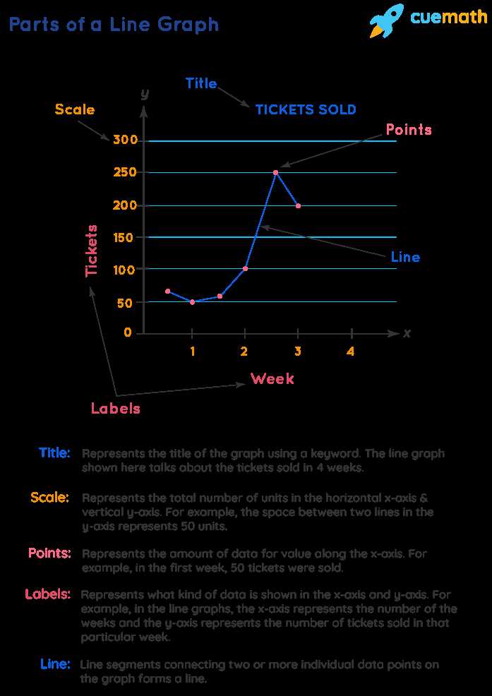
Data points are the individual values plotted on the graph. They represent the relationship between the independent and dependent variables. Each data point is marked with a dot or a small symbol.
4. Lines
Lines connect the data points on a line graph. These lines help to show the trend or pattern in the data. They can be straight or curved, depending on the nature of the data.
5. Legend
The legend is a key that explains the meaning of different lines or symbols used in the graph. It helps the reader understand the data and differentiate between multiple lines or data sets.
6. Gridlines
Gridlines are horizontal and vertical lines that form a grid on the graph. They help in reading and interpreting the data accurately by providing a reference for the data points.
7. Labels
Labels are used to provide additional information about the data points or specific sections of the graph. They can be used to highlight important data or provide explanations for any unusual patterns or trends.
Uses and Examples of Line Graphs
A line graph is a powerful tool for visualizing data trends and patterns over time. It is widely used in various fields, including business, finance, science, and social sciences. Here are some common uses and examples of line graphs:
- Tracking Stock Prices: Line graphs are commonly used in finance to track the price movements of stocks over time. By plotting the stock prices on the y-axis and the time on the x-axis, analysts can easily identify trends, patterns, and potential investment opportunities.
- Monitoring Sales Performance: Businesses often use line graphs to monitor their sales performance over time. By plotting the sales figures on the y-axis and the time on the x-axis, companies can identify seasonal trends, track the success of marketing campaigns, and make informed decisions to improve their sales strategies.
- Visualizing Population Growth: Line graphs are useful for visualizing population growth over time. By plotting the population size on the y-axis and the years on the x-axis, demographers can analyze trends, predict future population growth, and plan for resource allocation and infrastructure development.
- Examining Temperature Changes: Meteorologists often use line graphs to examine temperature changes over time. By plotting the temperature on the y-axis and the dates on the x-axis, weather experts can identify seasonal patterns, track climate change, and make predictions about future weather conditions.
- Analyzing Website Traffic: Line graphs are commonly used in web analytics to analyze website traffic over time. By plotting the number of visitors on the y-axis and the dates on the x-axis, website owners can track the effectiveness of marketing campaigns, identify peak traffic periods, and make data-driven decisions to optimize their websites.
These are just a few examples of how line graphs can be used to analyze and visualize data. The versatility and simplicity of line graphs make them an essential tool for data analysis and decision-making in various industries.

Emily Bibb simplifies finance through bestselling books and articles, bridging complex concepts for everyday understanding. Engaging audiences via social media, she shares insights for financial success. Active in seminars and philanthropy, Bibb aims to create a more financially informed society, driven by her passion for empowering others.