
Line Chart Definition
A line chart is a type of chart that displays information as a series of data points connected by straight line segments. It is commonly used to show trends over time or to compare multiple data sets. Line charts are effective in visualizing continuous data and can be used in various fields such as finance, economics, and science.
Line charts are particularly useful for identifying patterns, trends, and changes over time. They can help to analyze data, make predictions, and communicate information effectively. Line charts can also be customized with various formatting options, such as adding labels, titles, and gridlines, to enhance the clarity and readability of the chart.
Overall, line charts are a valuable tool in data analysis and visualization, providing a clear and concise representation of trends and relationships in a visual format. Whether you are analyzing stock prices, tracking sales data, or studying scientific data, line charts can help you understand and interpret the data more effectively.
Types of Line Charts
Line charts are versatile and can be used to represent various types of data. Here are some common types of line charts:
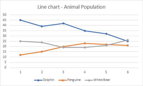
- Basic Line Chart: This is the most common type of line chart, where data points are connected by straight lines. It is used to show the trend or progression of a single variable over time.
- Step Line Chart: Instead of connecting data points with straight lines, step line charts use horizontal and vertical lines to represent changes in the data. It is useful when the data changes abruptly.
- Area Chart: An area chart is similar to a basic line chart, but the area below the line is filled with color. It is used to show the cumulative effect of multiple variables over time.
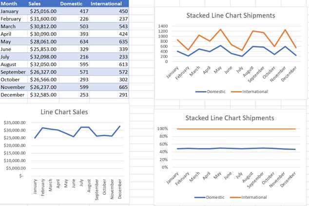
- Stacked Area Chart: This type of line chart is used to compare the contribution of different variables to the total. Each variable is represented by a different colored area, stacked on top of each other.
- Percentage Area Chart: Similar to the stacked area chart, but the areas are normalized to show the percentage contribution of each variable.
- Range Line Chart: Range line charts are used to show the range of values for a variable over time. They consist of two lines, representing the upper and lower bounds, with the actual values plotted in between.
These are just a few examples of the types of line charts that can be created. The choice of chart type depends on the nature of the data and the insights you want to convey.
Line Chart Examples
A line chart is a visual representation of data that shows the relationship between two or more variables. It is commonly used in technical analysis to analyze trends and patterns over time. Here are some examples of line charts:
1. Sales Performance
One common use of line charts is to track sales performance over a period of time. For example, a line chart can show the monthly sales revenue for a company over the course of a year. This allows businesses to identify trends and make informed decisions based on the data.
2. Stock Market Trends
Line charts are frequently used in stock market analysis to track the price movement of a particular stock or index. By plotting the closing prices over time, traders and investors can identify patterns and make predictions about future price movements.
3. Temperature Variation
Line charts can also be used to visualize temperature variations over time. For example, a line chart can display the average daily temperature for a specific location over the course of a month or year. This can help meteorologists and climate scientists analyze climate patterns and make forecasts.
4. Website Traffic
Line charts are often used to track website traffic and user behavior. By plotting the number of visitors or page views over time, website owners can identify peak periods, analyze user engagement, and make data-driven decisions to optimize their websites.
These are just a few examples of how line charts can be used to visualize data. Whether you’re analyzing sales data, stock market trends, weather patterns, or website traffic, line charts provide a clear and concise way to understand and interpret complex data sets.
How to Make a Line Chart in Excel
Making a line chart in Excel is a simple and effective way to visualize data trends over time. Whether you are tracking sales figures, stock prices, or any other type of data that changes over a period, a line chart can help you understand the patterns and make informed decisions.
Step 1: Prepare Your Data
Step 2: Select Your Data
Once your data is organized, select the range of cells that you want to include in your line chart. This can be done by clicking and dragging your mouse over the desired cells.
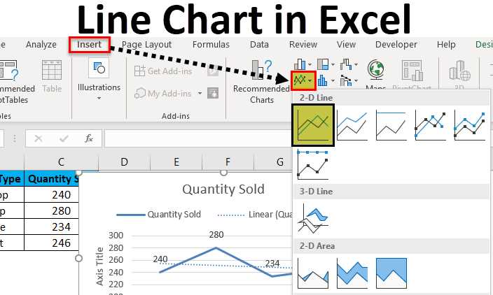
Step 3: Insert a Line Chart
With your data selected, go to the “Insert” tab in the Excel ribbon and click on the “Line” chart type. Choose the specific line chart style that best suits your data and click on it.
Step 4: Customize Your Chart
After inserting the line chart, you can customize it to fit your needs. You can change the chart title, axis labels, and add a legend if necessary. You can also format the data series by changing the line color, marker style, and line thickness.
Step 5: Update Your Chart
If your data changes or you want to add more data to your chart, you can easily update it. Simply right-click on the chart and select “Edit Data” or use the “Select Data” option in the chart tools. From there, you can add or remove data series and adjust the range of cells included in the chart.
By following these steps, you can create a line chart in Excel and effectively analyze your data trends. Line charts are a powerful tool for visualizing data over time and can help you make data-driven decisions in various fields, from finance to marketing.
Step-by-Step Guide to Creating a Line Chart in Excel
Creating a line chart in Excel is a simple and effective way to visualize data trends over time. Whether you’re analyzing sales figures, tracking stock prices, or monitoring project progress, a line chart can provide valuable insights. Follow these step-by-step instructions to create your own line chart in Excel:
Step 1: Prepare Your Data
The first step is to gather and organize the data you want to plot on the line chart. Make sure your data is in a tabular format, with the time or date values in one column and the corresponding data values in another column.
Step 2: Select the Data
Select the range of data that you want to include in your line chart. This can be done by clicking and dragging the mouse over the cells, or by using the keyboard shortcuts. Make sure to include the column headers if you want them to be included in the chart.
Step 3: Insert a Line Chart
Go to the “Insert” tab in the Excel ribbon and click on the “Line” chart type. Choose the specific line chart style that best suits your data and visualization needs. The line chart will be inserted onto your worksheet.
Step 4: Customize the Chart
With the line chart selected, you can customize various aspects of its appearance and layout. This includes modifying the axis labels, adding a title, adjusting the legend, and changing the colors or styles of the lines. Experiment with different options to create a chart that effectively communicates your data.
Step 5: Add Data Labels or Markers (Optional)
If you want to provide additional information on the chart, you can add data labels or markers. Data labels can display the exact values of the data points, while markers can highlight specific points of interest. This can be done by right-clicking on the chart and selecting the appropriate options from the context menu.
Step 6: Analyze and Interpret the Chart
Once your line chart is complete, take the time to analyze and interpret the data it presents. Look for trends, patterns, or anomalies that may be hidden within the chart. Use the chart to support your analysis and make informed decisions based on the insights gained.
By following these step-by-step instructions, you can easily create a line chart in Excel to visualize your data and gain valuable insights. Experiment with different chart styles and customization options to create charts that effectively communicate your data to your audience.

Emily Bibb simplifies finance through bestselling books and articles, bridging complex concepts for everyday understanding. Engaging audiences via social media, she shares insights for financial success. Active in seminars and philanthropy, Bibb aims to create a more financially informed society, driven by her passion for empowering others.